Art Direction, Graphic Design, Concept Development, Web Design
In 2021, I developed a new visual identity forChanging Haemophiliaat Novo Nordisk, following the company’s corporate visual identity update in 2020.Changing Haemophiliais a patient and HCP-oriented, community-driven platform for the rare disease;haemophilia. My task was to create adistinctivevisual identity that aligned with the new CVI while maintaining its own unique character.
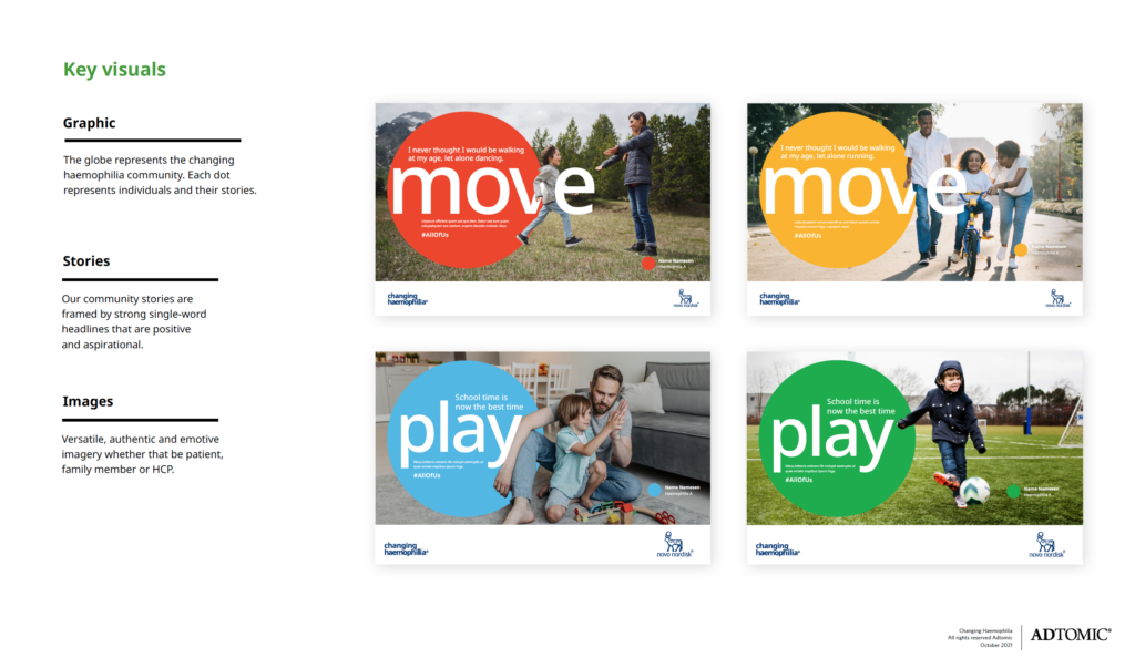
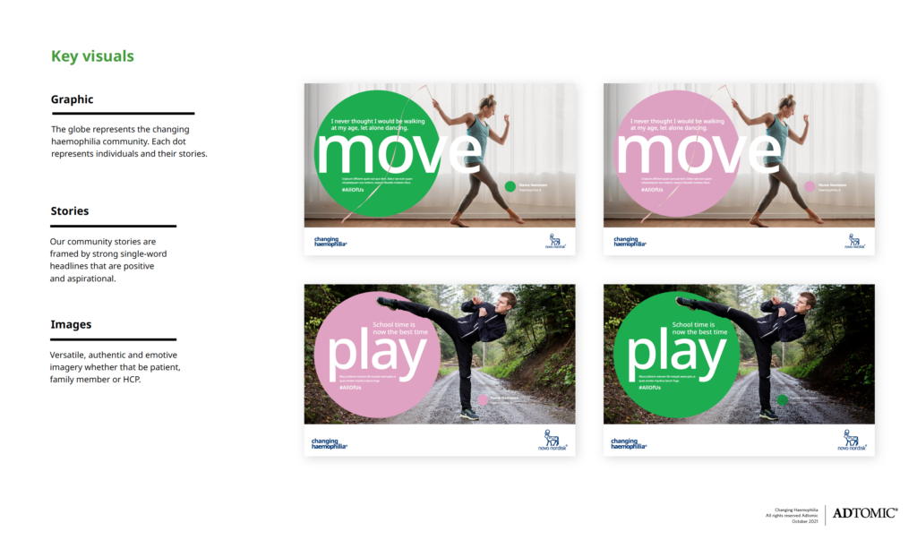
Since most cases of haemophilia are diagnosed ininfancy or early childhoodthe visual identity needed to resonate withchildren, parents and HCPs, while still respecting the serious and sensitive nature of the topic. Additionally, it was crucial tostay true to and honorthe updated CVI. With the new identity, I introduced a fresh approach to Novo Nordisk’scolor palette, balancing aplayful and engagingaesthetic suitable for depicting children while maintaining aserious and reassuring tone.
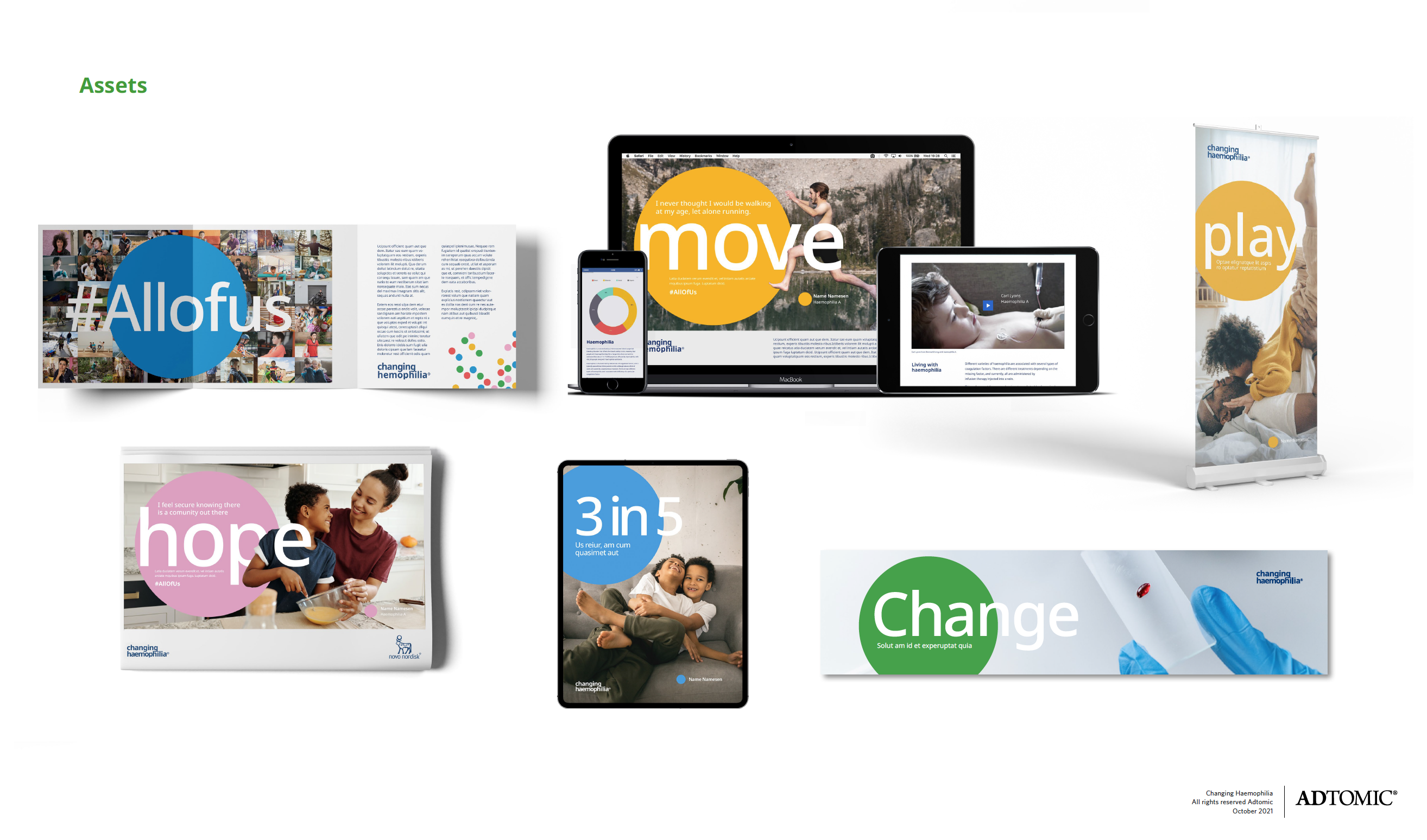
The design was centered around thecircleas a key graphic element, symbolizingunity, inclusivity, and continuity. Circles were used ina dynamic and playful way, helping tosoften difficult messageswhile evoking asense of hope and optimism.
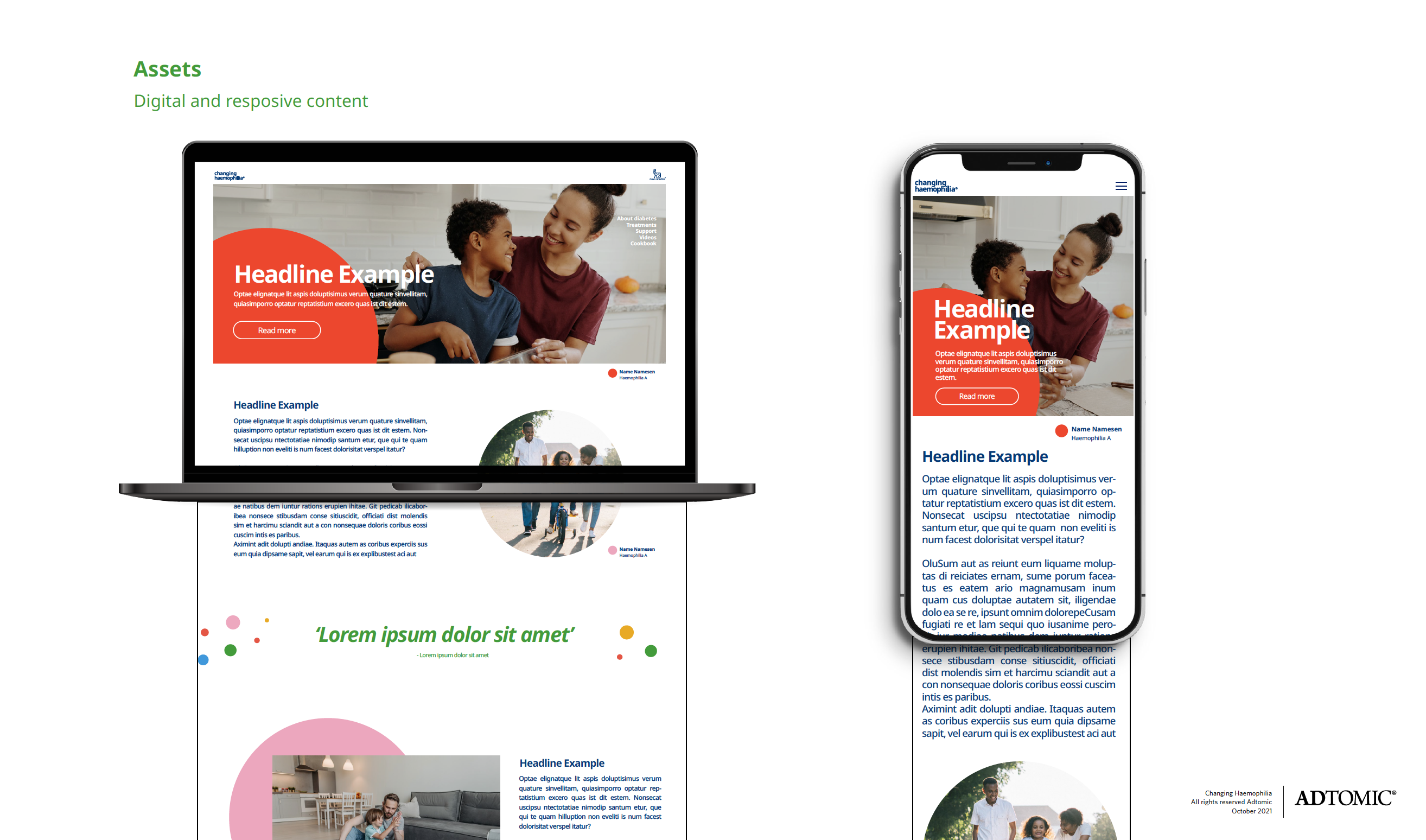
As part of the project, I also led afull website redesign, ensuring it wasvisually engaging, user-friendly, and fully alignedwith the refreshed identity.